بادی پارگراف تسک 1


پارگراف های اصلی (بادی) گزارش (ریپورت) نگارش (تسک) 1، نگارش شماره 1 آزمون آیلتس بطور معمول بصورت 4 پارگرافی هست، که پارگراف ابتدایی اینترو داکشن که از نوشتن خود سوال با واژگان دیگر، پارگراف اوور ویو که در دو الی 3 جمله نکات مهم رو معرفی می کنه بدون دادن جزییات عددی، پارگراف 3 و 4 هم جزییات هست که شباهتها و تفاوت ها رو با هم دسته بندی و مقایسه می کند.
Body 1: Present important information.
Body 2: Present important information.
By adhering to this structured approach, writers can effectively navigate the complexities of the visual data presented in IELTS Writing Task 1 and convey their analysis in a clear, coherent manner. Each paragraph serves a distinct purpose, from providing an introductory context to offering an overview of key trends and presenting a detailed analysis, ensuring that the reader can easily follow the progression of ideas and insights presented in the response.
II. Simple and Effective Approach to IELTS Writing Task 1: Body Paragraph
1. Writing 2 paragraphs for IELTS Writing Task 1: Body Paragraph
An effective Task 1 writing always requires 2 body paragraphs because:
Having only one body paragraph can overload the information and make it difficult for the reader to follow, indicating that the writer cannot process and organize information logically and effectively.
Having more than two body paragraphs can lead to the error of separating trivial information.
Recommended writing time: 10 minutes.
2. 4 steps to writing the IELTS Writing Task 1: Body Paragraph
The process of writing the IELTS Writing Task 1: Body Paragraph is usually carried out according to the steps below. Refer to them now to effectively prepare for your IELTS at home:
Step 1: Find a logical way to divide the two main body paragraphs.
Divide by time: For charts that tend to change over time, choose a year to divide the chart into two halves. Body 1 will describe from the first year to the dividing point, and Body 2 will describe the remaining period from the dividing point to the last year.
Divide by similarity: Group similar variables (lines, types of columns, groups of columns, horizontal or vertical rows...) with similar trends or magnitudes into one paragraph.
Step 2: Select the most important information to include in the essay:
Overall trends for the entire chart and the most prominent smaller trends in each variable.
Key points: Starting point, highest point, lowest point, intersection point, ending point...
Comparisons between variables: Higher, lower for each stage or specific points.
Step 3: Sequence the information within each paragraph: MOST SIGNIFICANT → LEAST SIGNIFICANT
Always describe the information in order of importance, with larger quantities, magnitudes, significant importance, and high influence described first.
Step 4: Proofread - 2 minutes
Refer to additional articles for more information:
Master how to write IELTS Writing Task 1: Introduction
A comprehensive guide on how to write an IELTS Writing Task 1: Overview
3. Examples of specific approaches to writing IELTS Writing Task 1: Body Paragraph
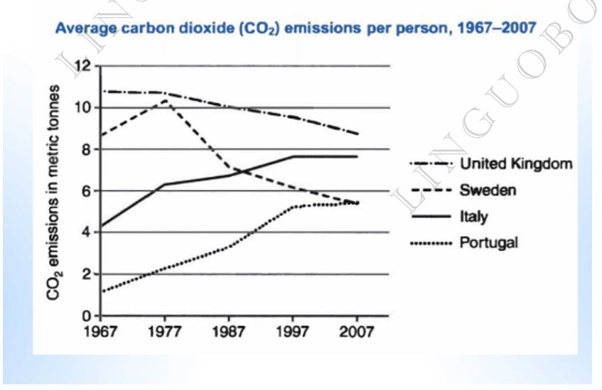
Task: “The graph below shows average carbon dioxide (CO2) emissions per person in the United Kingdom, Sweden, Italy and Portugal between 1967 and 2007”
How to write Task 1 Body:
Starting at slightly under 11 metric tonnes in 1967, the average carbon dioxide emissions per UK citizen continuously declined to reach around 9 metric tonnes in 2007 and always maintained the top position. Meanwhile, Sweden’s figure, initially ranked just behind the UK’s, saw an initial jump from 8 to 10 metric tonnes in the first 10 years, but this number fell rapidly afterward by half in the last year of the assessment period, placing it third in terms of CO2 emissions per person.
Turning to Italy and Portugal, both countries experienced a similar rising rate over the time frame. Italy’s emissions doubled from 4 to almost 8 metric tonnes, surpassing that of Sweden in 1987 to rank second after the United Kingdom. Similarly, Portugal’s number increased fivefold from 1 billion to 5 billion to tie with Sweden’s for third place.
IELTS Academic task 1
Lesson 2: organizing body paragraphs
After you’ve written a short introduction, you start writing the body paragraphs. There, you should describe your graph by providing the data.
In order to organize your body paragraphs well, you should
1. give a general overview
2. group your data by some feature; describe each similar feature in a separate paragraph.
Example 1: line graph
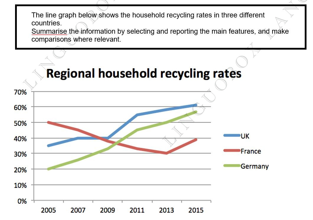
The line graph below shows the household recycling rates in three different countries.
Summarise the information by selecting and reporting the main features, and make comparisons where relevant.
When giving a general overview, you shouldn’t state any specific details, you should simply write what’s happening on the graph overall.
It's a good technique to write 'Overall,' before giving an overview.
In this example it could be done as follows:
Overall, recycling rates of UK and Germany showed a steady but significant rise over the period, while percentage of recycled waste in France experienced a downward trend.
Basically, you’re saying that UK and Germany’s rates ↑ , France’s rates ↓ . It's very important to give an overview, your essay will score much lower without it!
Then, you should group data by some feature and give specific details. In this line graph you can group data in two ways:
a. by country
Describe each country’s recycling rates in a separate paragraph
b. by similar trend
As you can see, the UK and Germany followed a similar trend: their recycling rates were increasing throughout the period, while recycling rates of France experienced a fall.
So you can describe an “increase pattern” in the first paragraph and a “decrease pattern” in the second paragraph.
The last option is better. Here's an example of providing specific data:
In 2005 the recycling rates of UK and Germany were nearly 35% and 20% respectively. Germany's rate increased sharply throughout the period, exceeding France's rate in 2009 and reaching almost 60% in the end of the period. In the meantime, the percentage of recycled waste in UK grew to 40% in 2007, and then remained steady until 2009. During 2009-2011 it experienced a rapid surge to more than 50% and continued with a gradual increase to 60% in 2015.
In early 2005 the recycling rate of France was the highest among these three countries. However, it dramatically declined to 30% in 2013. Then, there was a growth of 10% in 2015, but France's recycling rate was the lowest in the end of the period.
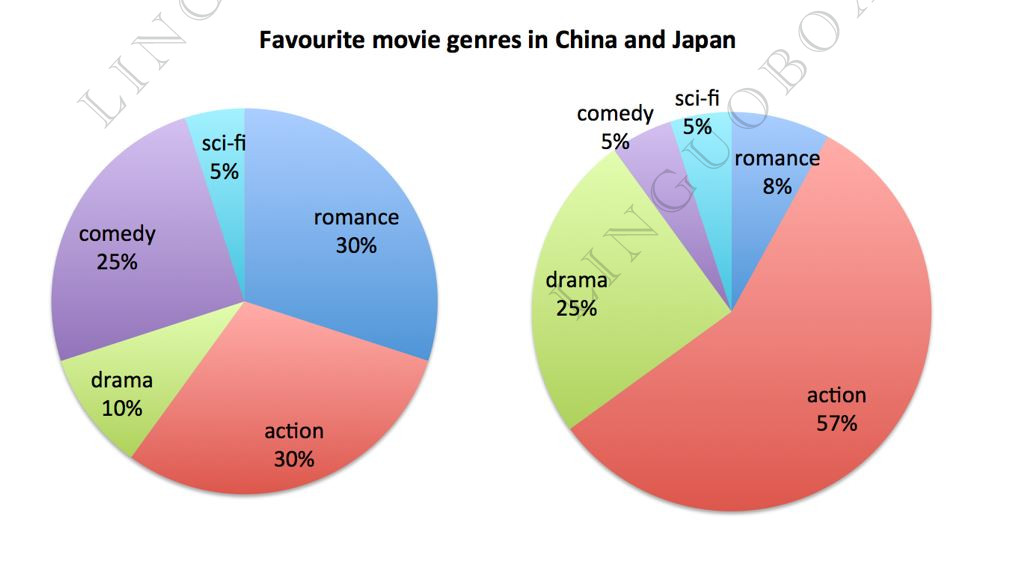
Example 2: pie chart
In this pie chart there are also several ways to group data:
a. by country
Describe each country’s percentages in each paragraph.
b. by movie genre
Compare each movie genre in a separate paragraph.
c. by similar trend
Describe the most popular genres in the first paragraph, and the least popular genres in the second paragraph.
Note that if you have a process description question, you have no other choice to group data but to describe each stage of a process.
Similarly, if your question asks you to compare two maps, your only option of grouping data is describing each change on the map.
Paragraphs 3 and (sometimes) 4: Use data/details to highlight a key feature of the visual(s)
Now that you’ve presented a summary of the main information in the visual(s), you’re ready to go into details in Paragraph 3. This is where you report data related to the summary information you just provided in Paragraph 2. You should not attempt to describe ALL of the data you see in the visuals. This would probably be impossible within the time limit even if you tried. You have to make choices. Instead, you should report about data that relate directly to the main feature(s)—the key information—that you just presented in Paragraph 2.
In Paragraph 2 of the model response, I focused on how 1) computer ownership rose steadily from 2002-2010 in general and across education levels, but that 2) those with the least education increased their computer ownership most over this period. Therefore, it would make sense to follow this paragraph with detailed information on these trends. As I described earlier in this post, these are the “angles,” or perspectives, I’ve taken on the graphs.
At this point, you have a second choice to make. Should you present all of the data in one paragraph (Paragraph 3), or should you separate it into two shorter paragraphs (Paragraphs 3 and 4)?
It is not necessary to include a 4th paragraph in your response, and it won’t always add to your score to include one (unless you haven’t met your 150 word minimum!). However, many times having two shorter paragraphs can be best. This is especially true in cases where you need to present data/details about two distinct key features. In these cases, a 4th paragraph helps you to present different ideas clearly. For this reason, I chose to present the information in two shorter paragraphs in our example response.
• Below are example paragraphs 3 and 4 for our practice question:
In 2002, slightly more than half the population owned computers. That number increased to roughly 75% over the next eight years. Postgraduates were always ahead of the general population. While roughly three-quarters of postgraduates owned computers in 2002, that figure rose to nearly 95% by 2010. By contrast, those who had not finished high school began with only a 15% computer ownership rate, which increased to about 45% after eight years.
Notably, the three groups at the lowest end of the education spectrum saw the most significant computer ownership gains over this period. Their rate rose approximately 30 percentage points. College graduates and postgraduates saw more modest gains with 20-point increases between 2002 and 2010.
Give an Overview
You also need to state what the main trend or trends in the graph are. Don’t give detail such as data here – you are just looking for something that describes what is happening overall.
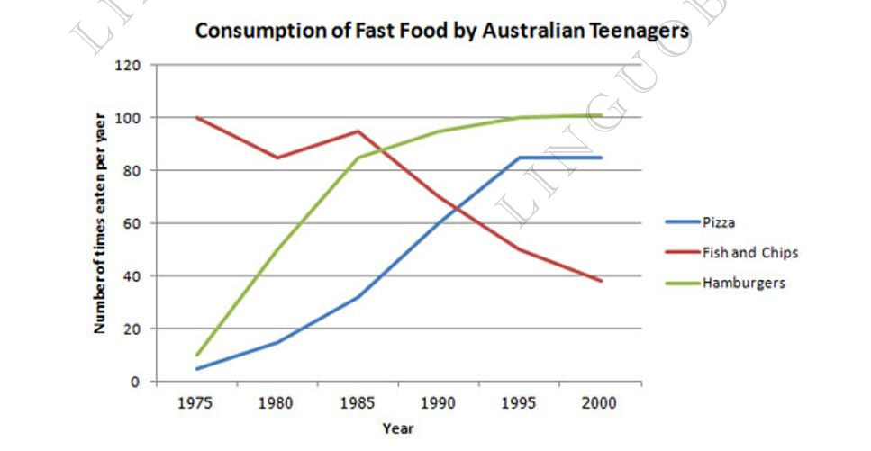
One thing that stands out in this graph is that one type of fast food fell over the period, whilst the other two increased, so this would be a good overview.
Here is an example:
Overall, the consumption of fish and chips declined over the period, whereas the amount of pizza and hamburgers that were eaten increased.
This covers the main changes that took place over the whole period.
You may sometimes see this overview as a conclusion. It does not matter if you put it in the conclusion or the introduction when you do an IELTS writing task 1, but you should provide an overview in one of these places.
Give the Detail
You can now give more specific detail in the body paragraphs.
When you give the detail in your body paragraphs in your IELTS writing task 1, you must make reference to the data.
Group Data
The key to organizing your body paragraphs for an IELTS writing task 1 is to group data together where there are patterns. To do this you need to identify any similarities and differences.
Look at the graph – what things are similar and what things are different? As we have already identified in the overview, the consumption of fish and chips declined over the period, whereas the amount of pizza and hamburgers that were eaten increased.
So it is clear that pizza and hamburgers were following a similar pattern, but fish and chips were different. On this basis, you can use these as your ‘groups’, and focus one paragraph on fish and chip and the other one on pizza and hamburgers.
Here is an example of the first paragraph:
In 1975, the most popular fast food with Australian teenagers was fish and chips, being eaten 100 times a year. This was far higher than Pizza and hamburgers, which were consumed approximately 5 times a year. However, apart from a brief rise again from 1980 to 1985, the consumption of fish and chips gradually declined over the 25 year timescale to finish at just under 40.
As you can see, the focus is on fish and chips. This does not mean you should not mention the other two foods, as you should still make comparisons of the data as the questions asks.
The second body then focuses on the other foods:
In sharp contrast to this, teenagers ate the other two fast foods at much higher levels. Pizza consumption increased gradually until it overtook the consumption of fish and chips in 1990. It then levelled off from 1995 to 2000. The biggest rise was seen in hamburgers as the occasions they were eaten increased sharply throughout the 1970’s and 1980’s, exceeding that of fish and chips in 1985. It finished at the same level that fish and chips began, with consumption at 100 times a year.
Full Model Answer:
The line graph compares the fast food consumption of teenagers in Australia between 1975 and 2000, a period of 25 years. Overall, the consumption of fish and chips declined over the period, whereas the amount of pizza and hamburgers that were eaten increased.
In 1975, the most popular fast food with Australian teenagers was fish and chips, being eaten 100 times a year. This was far higher than Pizza and hamburgers, which were consumed approximately 5 times a year. However, apart from a brief rise again from 1980 to 1985, the consumption of fish and chips gradually declined over the 25 year timescale to finish at just under 40.
In sharp contrast to this, teenagers ate the other two fast foods at much higher levels. Pizza consumption increased gradually until it overtook the consumption of fish and chips in 1990. It then levelled off from 1995 to 2000. The biggest rise was seen in hamburgers as the occasions they were eaten increased sharply throughout the 1970’s and 1980’s, exceeding that of fish and chips in 1985. It finished at the same level that fish and chips began, with consumption at 100 times a year.
Paragraph 2: Body Paragraph A
Word Count: 50 Words
Pick one of the main features that you mention in the first paragraph. Now, you can explain this feature in detail. You can do this in 3 – 5 sentences.
Mention all the numbers and measurements that are relevant to this feature. This might feel like you are simply copying down the data that you see in the chart or table. That’s okay! This is exactly what you want to do in Writing Task 1. Again, this is not about forming an opinion or an argument.
You can also compare features here. Look for opposites or contrasting data points, as they are easiest to describe.
Paragraph 3: Body Paragraph B
Word Count: 50 Words
Just like in the previous paragraph, all you have to do now is describe the main feature. Follow the same method as above. When done, you do not have to write a conclusion. Simply move on to Writing Task 2.
FAQ about IELTS Academic Writing Task 1
Q: How can I improve my writing?
A: The best advice is the simplest: read a lot and write a lot. Reading will help you develop a natural sense of how words, sentences, and paragraphs fit together. Studying grammar is helpful, but reading will improve your knowledge of collocations, something that is hard to internalize by rote memorization (rote learning relies on simple repetition and memorization) alone.
Q: How many paragraphs should I write?
A: As mentioned above, you can write three or four paragraphs. If you decide to do four instead of three, simply separate the first two sentences into separate paragraphs. The first sentence can be an introductory paragraph, and the second can be an overview paragraph.
Q: Should I write a conclusion for Task 1 Academic?
A: Unlike in Writing Task 2, a conclusion is not required.
Q: How many words should I write?
A: You should write at least 150 words. Many students find that this is too short and feel they need to write more. If you feel this way, aim for 200 words instead.
However, be careful not to write too much. A longer answer means that you probably spent more time writing it. The time used for Writing Task 1 is time taken away from Writing Task 2. This is because as soon as you finish Task 1, you can begin Task 2.
