اینتروداکشن تسک 1


اینتروداکشن تسک 1، در آزمون رایتینگ شماره 1 آیلتس آکادمیک مقدمه به نوشتن همان سوال به گونه ای دیگر می گویند، باید برای واژگان کلیدی سوال مترادف استفاده کنیم و اگر بتوانیم سوال رو جور دیگه ای مطرح کنیم، که واژگان کلیدی و مفهموم سوال رو به درستی با واژگان خودمان بیان کنیم، در اینصورت مقدمه ما کافی است.
IELTS Academic task 1
Before we dive into details, there are three things you MUST NOT DO while writing a Task 1 response.
1. DO NOT INCLUDE IMAGINARY INFORMATION
2. DO NOT INCLUDE YOUR OWN OPINION ABOUT THE DATA
3. DO NOT INCLUDE THE REASONS FOR FIGURES
Academic Writing Task 1 tests your ability to analyze charts and report the given statistics. If you provide any irrelevant information, you will be marked down.
Lesson 1: how to write introduction?
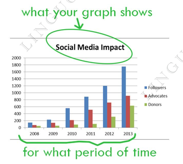
You should start your task 1 answer by introducing the graph from your question. Just write 1-2 sentences to say what your graph shows and for what period of time (if there is one).
To do this, you need to paraphrase text from your task 1 question.
Example of good introduction:
Question:
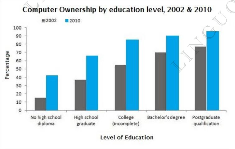
The graphs below give information about computer ownership as a percentage of the population between 2002 and 2010, and by level of education for the years 2002 and 2010.
Introduction:
The bar charts show data about computer ownership, with a further classification by level of education, from 2002 to 2010.
To write a good introduction, follow these techniques:
1. Change introductory expressions
the graph/chart/table/diagram
o gives information about/on
o provides information about/on
o shows
o illustrates
o represents
o depicts
displays o
demonstrates o
o gives reason why (only if graph provides reasons for smth)
o explains why (only if graph provides explanation for smth)
o compares (only if several items are compared)
Attention with word compare! You can say:
o compares smth in terms of smth
the charts compare two cities in terms of the number of employed people.
o compares smth in year1 and year2
the graph compares the population in 2000 and 2013.
Examples:
o “The pie charts provide information on the proportion of males and females working in agricultural sector.” OR “The pie charts show the proportion of males and females working in agricultural sector.”
o “The table compares five companies in terms of the number of employees.” OR “The table illustrates the number of employees in five companies.”
2. Paraphrasing
You can rewrite a phrase by using the word how:
o shows the number of people ... = shows how many people ...
o depicts changes in spending on ... = depicts how much changed spending on ...
You can rewrite a phrase by using synonyms:
o number of = quantity of (not interchangeable with amount of)
o spending = expenditure
o rate = percentage
o ratio = proportion
o information = data
o change can be sometimes replaced by increase, decrease or variation
o share = portion
o place = site
3. Time periods
o from 1985 to 1995 = between 1985 and 1995
o in 1985 = in the year 1985
o in 1985 and 1995 = in 1985 and 1995 respectively = in the years 1985 and 1995
Examples:
o The table shows consumption rates from 2001 to 2004.
o The graph shows consumption rates in 2012 and 2015 respectively.
Paraphrasing in use:
See how the topic was paraphrased to make a very good task 1 introduction (picture on the right).
What was changed:
• Show is changed to compare
• Percentages added
• Different added
• In 2007 and 2009 → In the years 2007 and 2009
As you see, you don't have to make up a completely new introduction. Just take the given topic as a base, and change/add some details.
The Introduction
The introduction is the first paragraph, which introduces the chart or charts in Task 1. Here, you need to paraphrase the chart description given in the question. However, what you should never do is copy the exact phrase from the question.
Let’s take a look at the question below:
IELTS Writing Task 1 Example
You should spend about 20 minutes on this task.
The chart below shows the time needed (in years) to close the following global gender gaps based on the trends in 2020 and 2021.
Summarise the information by selecting and reporting the main features, and make comparisons where relevant.
First of all, what will happen if you simply copy the sentence? There is no deduction for copying it, but the sentence will not be counted towards your total word count. It does not sound a big deal, but you will be given a lower band if your total word count does not meet the minimum requirement of 150 words. It is fine if just one or two words are borrowed, though.
Simple tactics when writing an introduction
1. Change the verbs.
Please remember that you do not need a fancy verb, such as present or indicate. Actually, *they are the wrong verbs for an introductory sentence. Just switch ‘show’ to ‘give information about’, and vice versa.
2. Use number units.
Numbers are provided with units, like percentages, kilograms and so on. In this question, it is years.
3. Specify the categories if possible.
In this chart, there are three different areas with gender gaps in addition to the overall figures. Refer to specific gaps to keep your answer as clear as possible.
Useful synonyms for your introduction:
• “the time needed to close the gap” → the amount of time required to close the gap , the number of years to close the gap , how long it was expected to take to close the gap , how many years it was thought to take to close the gap
• “close global gender gaps” → reduce gender inequality, achieve gender equality in the world, eliminate gender inequality worldwide
• “based on the trends” → taking the developments into account
• “in 2020 and 2021” → in the years 2020 and 2021, in two different years, 2020 and 2021
Introduction Structure Example
Let’s put them together. When you write your introduction, follow this simple structure:
The first few words are easy to rephrase, but the rest of the information is not. The most helpful thing is to keep practicing and learning more useful vocabulary by heart.
I will provide two more charts to practice with some helpful phrases. Write your own introductions and leave them in the comments. I will give feedback on a few select comments in the next post.
Exercises
TASK 1 – IELTS WRITING EXERCISE 1
You should spend about 20 minutes on this task.
The graph below gives information about the percentage of employees who had access to work from home benefits in the United States from 2011 to 2020.
Summarise the information by selecting and reporting the main features, and make comparisons where relevant.
Vocabulary suggestions:
• “the percentage of employees ” → the proportion of employees , figure for employees
• “employees with access to work from home benefits” → employees who were given the option to work from home, workers who were allowed to work remotely
• “from 2011 to 2020” → between 2011 and 2020
TASK 1 – IELTS WRITING EXERCISE 2
You should spend about 20 minutes on this task.
The chart shows the percentage of economic output lost by noncommunicable disease type in 2011.
Summarise the information by selecting and reporting the main features, and make comparisons where relevant.
Vocabulary suggestions:
• “economic output lost” → the cost to society, the cost to the economy
• “by noncommunicable disease type” → by five different non-infectious diseases, by five different diseases that are not infectious, by five different diseases that are not communicable
